Stunning Pop Art prompting guide
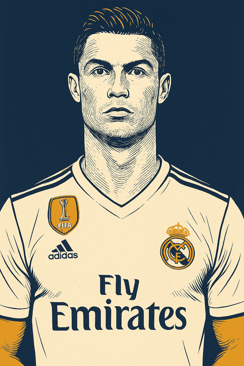
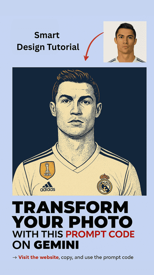
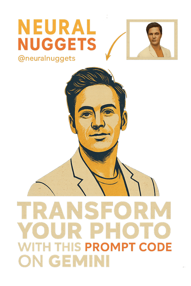
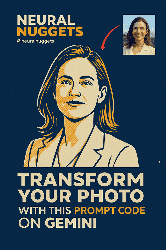
Looking to channel classic Pop Art energy with a modern vector twist? This stylized AI art prompt offers a cinematic, dramatic, and crisply rendered design—inspired by vintage engraving techniques and the limited palettes of early comic posters.
Designed for creatives, illustrators, and branding experts, this style embraces graphic minimalism, intense contrast, and a striking 4-color palette to deliver timeless visual storytelling.
Whether you’re creating a character portrait, editorial illustration, or poster series, this guide will walk you through the ideal structure for crafting that perfect stylized Pop Art vector image.
pro tip
–v 5.2 –ar 1:1 –style 4c –q 2
🔥 Prompt:
The first condition is that the original subject, proportions, and facial features must remain identical, do not change identity, anatomy, or pose, only apply the Pop Art Vector Poster artistic style with flat vector outlines and engraved cross-hatch shading, using ONLY this limited palette of dark blue, near-white (very light blue-white), pure white, and orange-yellow with 4 total colors, no other colors and no gradients unless specified; apply aged paper grain as texture substrate; use a solid dark blue background that is minimal and non-distracting; render the face in near-white tone to appear much lighter and distinct from clothing and background, keep the clothing pure white with orange-yellow accent; mood and lighting must be high-contrast dramatic; match the same line density, stroke width, palette, and shading method across different inputs; ensure the face remains visually distinct from both background and clothing; avoid text, watermarks, logos, extra objects, or anatomical distortions; keep edges crisp with no unwanted blur or noise. --ar 1:1 --seed 78654 --strength 0.35
Why This Prompt Works
✅ Iconic Color Palette
Limiting the palette to four contrasting tones—dark blue, near-white, pure white, and orange-yellow—evokes mid-century design with a bold and clean aesthetic. It forces clarity and simplicity, emphasizing structure and mood over realism.
✅ Engraved Cross-Hatching
Cross-hatch shading adds depth, texture, and vintage flair, mimicking hand-drawn illustrations from old newspapers or graphic novels.
✅ Visual Separation
Each visual element (face, clothing, background) has its own distinct tone to maintain strong hierarchy and clarity, even in a flat vector composition.
✅ Timeless Appeal
This style bridges the gap between classic poster art and contemporary digital design, making it ideal for merchandise, magazine covers, editorial portraits, and branding visuals.
🎯 Best Use Cases
- Editorial Portraits
Eye-catching illustrations for magazine features or blog content. - Music or Film Posters
Ideal for stylized depictions of artists or scenes with bold dramatic flair. - Merchandise (Tote Bags, Tees, Prints)
High-contrast vector art prints beautifully on both digital and physical media. - Album Covers or Social Media Avatars
This format delivers stylized identity without sacrificing recognizability. - Pop Culture Series
Create consistent series using the same prompt with different subjects (musicians, actors, influencers, etc.).
🎨 Key Visual Components Breakdown
1. Color Scheme
- Dark Blue: Used for solid background and some outlines.
- Near-White: Base tone for facial skin—keeps the face visually distinct.
- Pure White: For clothing, emphasizing neutrality and contrast.
- Orange-Yellow: Accent color on clothing or small elements (earrings, pins, etc.).
❗ No gradients, no extra tones. Stick to flat fills and solid shadows.
2. Textures & Shading
- Engraved Cross-Hatching: Adds depth to cheekbones, under eyes, neck, and hairlines.
- Aged Paper Grain Texture: Overlay texture adds subtle vintage grit—mimics real-world print posters.
3. Composition Rules
- Pose & Expression: Must match original subject photo.
- Lighting: High-contrast (think chiaroscuro), emphasizing light against shadow.
- Background: Always dark blue, minimal, and non-distracting.
4. Line Work
- Uniform Stroke Width: Keeps image looking like it belongs in a poster or screenprint.
- No Blur or Noise: Edges must be sharp, crisp, and clean—this is vector style, not painterly.
💡 Pro Tips for Visual Consistency
- Batch Render Multiple Subjects: Use the same prompt format with different names or references to create a collectible series.
- Test With Different Seeds: Small changes in
--seedcan slightly shift line density or layout while keeping core structure. - Match Line Style Across Edits: Don’t mix soft sketch lines with vector strokes. Commit to vector look.
- Texture Overlay as Final Pass: Add aged grain texture over the final render in Photoshop or another tool if your AI model doesn’t support textures.
🔧 Customization Ideas
- ✅ Swap orange-yellow for red or teal for alternate branding themes (if limited palette allows).
- ✅ Add frame or border in dark blue for a retro print feel.
- ✅ Use vertical format (2:3 or 4:5) for poster-like effect.
- ✅ Add vector halftone dots for added retro authenticity.
Where to Use This Pop Art Vector Prompt
Paid Advertising & Brand Campaigns
This Pop Art vector style is ideal for social ads, brand launches, and digital campaigns where bold visuals stop scrolling. It performs especially well on:
- Facebook Ads
- Instagram Stories & Reels
- Pinterest Promoted Pins
- Google Display Network banners
- Hero images on landing pages
Why Marketers Choose This Style for High CTR
- Bold Outlines & High Contrast: Makes visuals instantly readable, even at small sizes.
- Simplified Color Palette: Reduces cognitive load, helping the audience process the ad quickly.
- Stylized, Recognizable Identity: Maintains brand consistency while drawing attention.
Industries That Pay Premium CPM for This Visual Style
- Marketing & advertising agencies
- Fashion & lifestyle brands
- Music labels & film studios
- SaaS companies & startups
- Ecommerce & print-on-demand sellers
These industries often bid higher due to strong engagement metrics.
Typical Advertising Budgets
Brands often start testing these creatives with $10–$50/day, scaling up once engagement, CTR, and brand recall prove successful. High-contrast Pop Art visuals often outperform standard photo-based ads during cold-traffic testing.
Tools & Software for Professional Results
- AI Rendering: Midjourney, Leonardo AI
- Vector Editing: Adobe Illustrator, Figma
- Texture & Finishing: Photoshop, Canva Pro
These tools ensure high-quality assets suitable for print, social, and web campaigns.
Commercial Use & Licensing Considerations
When using AI-generated Pop Art vectors for:
- Paid campaigns
- Merchandise
- Client work
…make sure to check:
- Commercial usage rights
- Platform compliance
- Brand-safe content
This ensures monetization isn’t blocked and avoids legal issues.
Prompt Variations for A/B Testing
- Swap accent color (orange-yellow → red or teal)
- Vertical poster crop (2:3 or 4:5) for Instagram/Pinterest
- Halftone dots for extra retro effect
- Slightly different cross-hatch density for texture variation
A/B testing these variations can dramatically improve CTR and revenue.
Common Mistakes That Reduce Performance
- Overcomplicated backgrounds or gradients
- Soft or inconsistent linework
- Using too many colors beyond the limited palette
- Adding watermarks, text, or clutter that distracts from the main subject
Consistency and restraint maintain high ad performance.
Print, Merchandise & Production Compatibility
This style works beautifully for:
- Tote bags, T-shirts, mugs, and prints
- Posters & magazine covers
- Digital content, social media banners, and landing page hero images
High-resolution vector files ensure crispness across both print and digital.
Pricing Expectations for Pop Art Vector Illustrations
Freelancers or studios typically charge $50–$300 per asset, depending on:
- Complexity
- Commercial usage
- Licensing requirements
Best File Formats
- PNG for digital ads
- SVG / PDF for print and scalable assets
- PSD / layered AI files for editable backups
When Not to Use This Visual Style
Avoid this style if the project requires:
- Photorealism
- Subtle gradients or painterly effects
- Minimalist corporate graphics
It’s optimized for bold, graphic, high-contrast visuals that grab attention.
Brand Consistency Tips for Campaigns
- Keep the same color palette across all creatives
- Match stroke width, line density, and shading
- Use consistent backgrounds and textures
- Apply similar lighting/mood for multi-subject campaigns
